Anatomy of an App Window

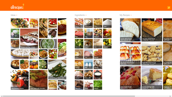
When you open an App in Windows 8, it will naturally fill the screen. It is very similar to what you might see on your smart phone, Kindle, Android or iPad. And I suppose that is OK. My only problem is the average home screen is a LOT larger than your average smart phone or Kindle Fire tablet.
There is special software (I love) that can make your Windows apps look and act more like normal windows, and I will be writing about it separately in the future. As it is now, because YOU, my DEAR READERS mean so much to me, I removed my favorite "cheater" software a few weeks ago when I began writing about Windows 8. I wanted to be sure I had my windows looking just like most everyone else's and my frustrations were like most everyone else's too. And they do, and they are. But as soon as I have written enough about these basics, my Stardock stuff is going right back on this machine! Then YOU can be unfrustrated too!
I've pretty much been sticking to my old favorites because they can be used on the Desktop and have much more traditional windows. You know the kind. You can move them around, resize them and layer them on top of other windows so you can quickly go from one software program to another any time you feel like it.
Ok, I'm griping, but only about this. For the most part, Windows 8 is really nice!
Ways to Close an App...
Before Windows 8.1 (if you have the older Windows 8) you had to move your mouse pointer to the top of the screen (apps fill the screen) until you saw "the hand". Then, while holding down the left mouse button, drag down until the window "disappears" into the bottom of the screen. Not very pretty, and certainly not very obvious to a veteran Windows user.
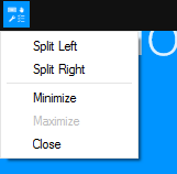
Windows 8.1 seems to be listening and now you can move your mouse pointer to the top of the screen (the apps still fill the screen) and you will see a (sort of) title bar across the entire top of the screen. The right corner actually has a minimize button and an X to exit the app. The left corner is kind of interesting too.

